
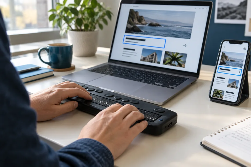
There is no ideal user
People use websites with different bodies, assistive technologies, devices, connections and amounts of attention. Someone navigates with a keyboard, enlarges text, uses a screen reader, looks at a display in bright sunlight or tries to finish a task on an unstable mobile connection. None of those situations is an edge case to the person experiencing it.
A good digital experience does not try to design that variation away. It keeps the essential path usable across different conditions and adds refinement without making access to content or functionality depend on one sense, one input method or a fast device.
Accessibility starts with structure and meaning
WCAG 2.2 provides testable, technology-independent accessibility criteria. Its principles organise the work around content that is perceivable, operable, understandable and robust. This translates into specific design and engineering choices: meaningful headings, text alternatives, sufficient contrast, visible focus, keyboard operation and error messages that explain how to recover.
Semantic HTML is the first layer. A real button, an associated form label and a logical heading structure give browsers and assistive technologies information that a generic container does not provide by itself. CSS controls presentation; JavaScript can add capability. Meaning remains recognisable when one layer is unavailable.
Conformance is a necessary baseline, not proof that every user can achieve their goal. WCAG itself states that the guidelines do not address every user need. Accessibility therefore also belongs in research, content, design decisions and usability evaluation.
Speed is part of usability
An interface can formally meet accessibility requirements and still exclude people through slow or unstable behaviour. Waiting for the main content, delayed responses after a click and shifting buttons affect everyone. Their impact grows on less powerful devices, slow networks or when someone needs more time to understand and operate an interface.
Core Web Vitals make three parts of that experience measurable. For a good assessment at the 75th percentile, Google recommends Largest Contentful Paint of no more than 2.5 seconds, Interaction to Next Paint of no more than 200 milliseconds and Cumulative Layout Shift of no more than 0.1. These thresholds are not the final definition of design quality, but they are useful signals for loading, responsiveness and visual stability.
Measure real visits as well as laboratory tests. Break results down by important page type and pay attention to the slower group, not only the average. A fast homepage does not compensate for a difficult form at the moment someone wants to become a customer.
Respond to more than screen width
Responsive design also covers text enlargement, zoom, orientation and input method. Content should reflow without horizontal searching. Actions need enough room for touch. Information that appears only on hover must also be available to keyboard and touch users.
Motion deserves the same care. Animation can clarify relationships and feedback without making the interface unstable. Respect reduced-motion preferences, preserve a clear focus order and prevent content from moving unexpectedly while someone reads or prepares to activate a control.
For every rich interaction, make the essential action explicit. When dragging, canvas or 3D adds depth, provide understandable controls that expose the same information or operation. Technology can then add meaning without creating a new barrier.
Evaluate through more than one lens
Automated checks quickly find problems such as missing names, invalid structure or certain contrast failures. They cannot decide whether alternative text is meaningful, a task feels logical or an unexpected status message is understood.
Combine pipeline checks with manual keyboard use, zoom and screen reader evaluation. Test essential tasks on real mobile devices and a slower connection. W3C recommends involving people with disabilities early in evaluation; their experiences reveal usability problems that checking a standard alone will not show.
User involvement does not replace technical evaluation, and an automated score does not replace users. Together they create a fuller picture of what works, for whom and under which conditions.
Six checks for every release
An inclusive process does not have to begin as a large separate project. Make these checks part of design, review and the definition of done. Trace problems back to components and agreements so the next change starts from a stronger foundation.
- Can the most important task be completed entirely with a keyboard, with focus remaining visible?
- Do content, order and functionality remain usable at 200% zoom and on a narrow screen?
- Do images, fields, status messages and errors have an appropriate textual meaning?
- Does the interface remain calm while loading and responding, including with reduced motion enabled?
- Do essential pages meet their agreed performance budgets in field data?
- Has the task been examined with people and devices that the team itself does not represent?
Inclusion is a property of the system
A good experience does not emerge by adding an accessibility report and a speed score just before release. It grows from decisions in content, design, components, code, infrastructure and feedback. Every discipline affects who can use the result.
When teams consider accessibility and performance from the first question, problems become visible sooner and solutions become reusable. ‘Works for everyone’ does not promise that every situation is already perfect. It means variation is a permanent design condition and the system continues to learn from the people it exists to serve.
Sources
- Web Content Accessibility Guidelines (WCAG) 2.2 — Geraadpleegd 24 september 2026
- W3C WAI: Involving Users in Evaluating Web Accessibility — Geraadpleegd 24 september 2026
- web.dev: Defining the Core Web Vitals metrics thresholds — Laatst bijgewerkt 7 mei 2025; geraadpleegd 24 september 2026